CashTapp Mobile App
ATMs haven't changed much in 50 years, besides being loaded with tons of new features and physical modules. This project was part of an effort to rethink the design of ATMs from the ground up - product strategy, physical design, interaction, and UX.
I led UX for the mobile app and worked closely with a team of engineers and designers to align the app with the ATM.



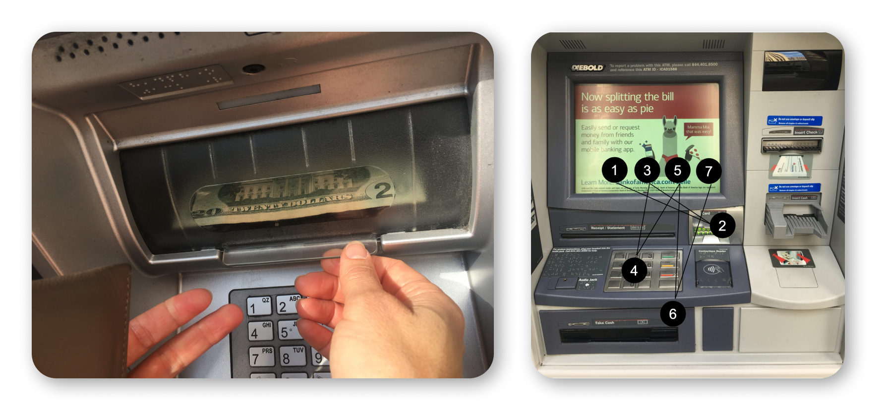
I worked closely with the PM to align the data and the customer needs into a problem statement that balances business and customer:
Customers need to dependably and rapidly withdraw $20-$120. Error rates and lines lead to frustration and long wait times.
How might we create a rapid cash withdrawal solution that focuses on low-amount cash withdrawals?
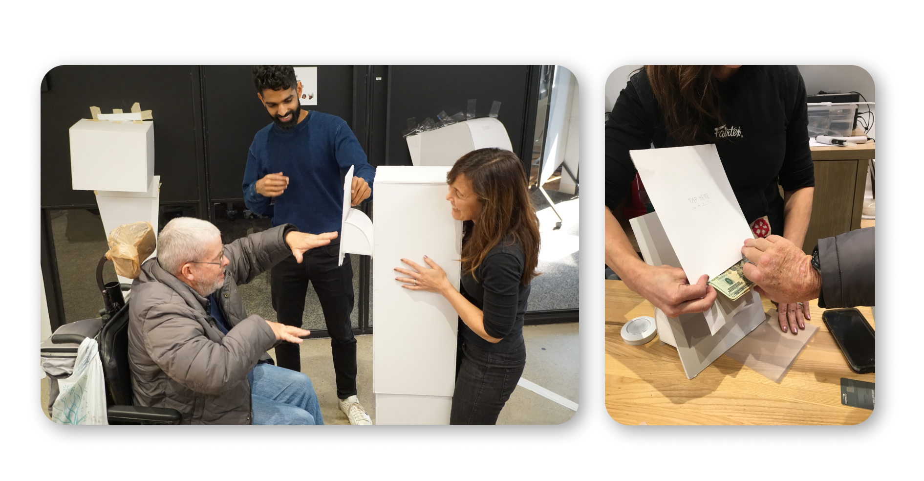
I tested the usability of a number of ATMs and noticing any potential pain points. With their consent, I observed users as they transacted at Capital One Cafe locations and conducted in-depth interviews.
Some of the behaviors I noticed included:
I held a stakeholder workshop to get all of our partners aligned on the project - ATM Ops, engineers, designers, and PMs.
As the design lead on the project I coached the team around design thinking for a diverse set of customers, helping them think at scale about how to solve the usability problems rather than just thinking about aesthetics.
The main issue I wanted to address was the issue of privacy - if users are uncomfortable at the ATM, how do I reduce that discomfort?
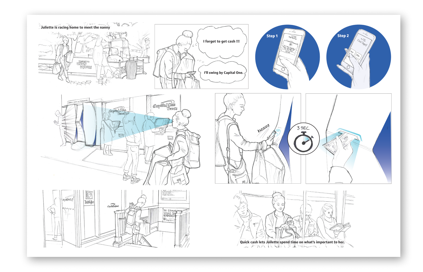
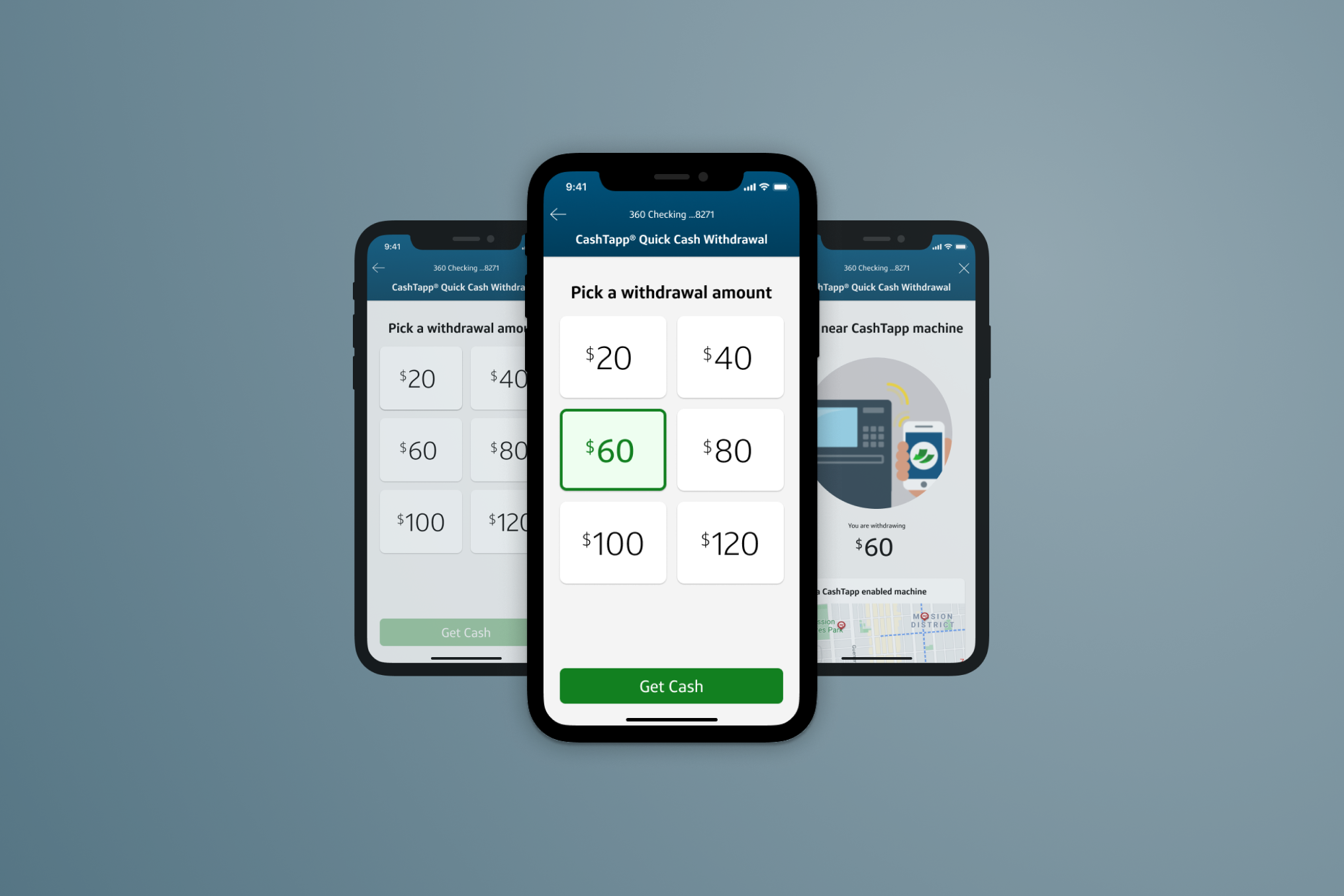
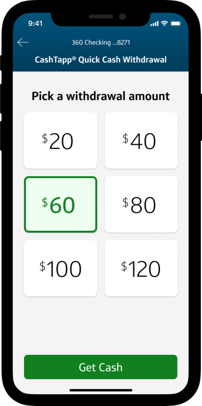
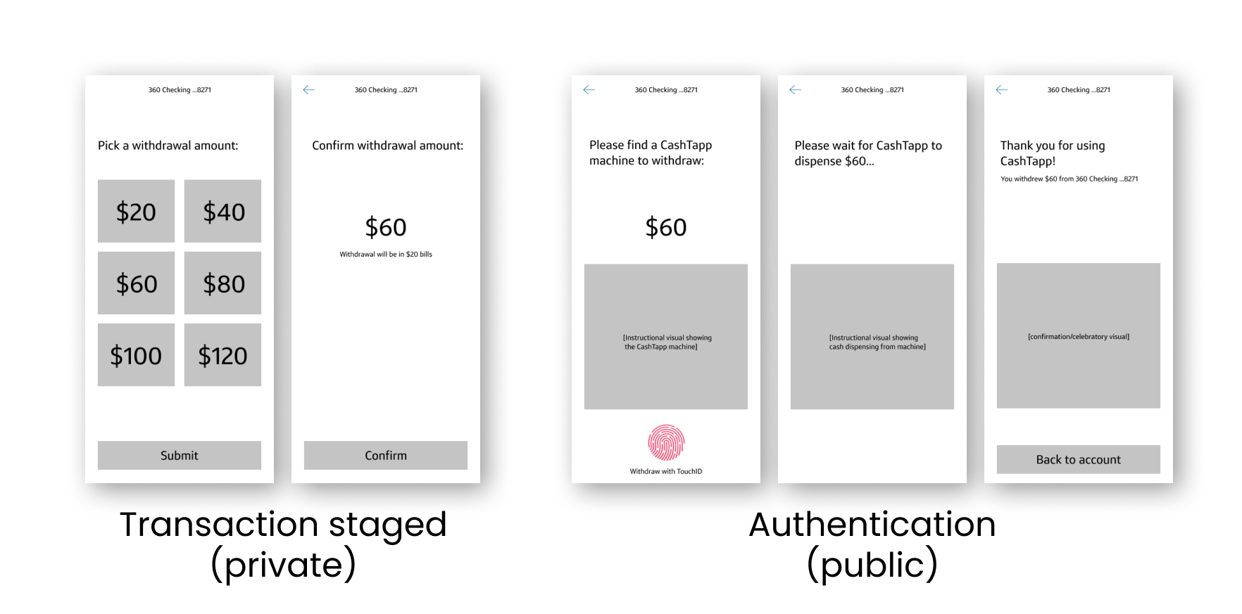
To address this, I split the transaction into two parts - the transaction is first staged - the user can pick a withdrawal amount on their phone, away from the withdrawal machine.
The second part of the transaction is public authentication into a physical withdrawal machine. This is the portion of the transaction that has to happen in public space using TouchID or pin to authenticate into your account and tapping the machine.
Some of the behaviors I noticed included:
- Users were shielding transactions with their bodies to prevent anyone from seeing their transaction
- Across the country, Capital One cafes were being flooded with Lines of people waiting for ATMs during peak times.
- I saw some frustration with users who had errors in their transactions.
- Visualized the sequence of events spatially on the interface - and you can see how complex a simple transaction can be.
- I also learned about the operational back end of ATMs - how machines are loaded with cash and some of the pain points in that process
I held a stakeholder workshop to get all of our partners aligned on the project - ATM Ops, engineers, designers, and PMs.
As the design lead on the project I coached the team around design thinking for a diverse set of customers, helping them think at scale about how to solve the usability problems rather than just thinking about aesthetics.
The main issue I wanted to address was the issue of privacy - if users are uncomfortable at the ATM, how do I reduce that discomfort?
To address this, I split the transaction into two parts - the transaction is first staged - the user can pick a withdrawal amount on their phone, away from the withdrawal machine.
The second part of the transaction is public authentication into a physical withdrawal machine. This is the portion of the transaction that has to happen in public space using TouchID or pin to authenticate into your account and tapping the machine.

In addition to launch, this project had some great outcomes:
- The project also resulted in over 20 patents for future ATM interactions and technology. This provided tremendous business value with 9 patents issued so far.
- Cashtapp reduced the time spent at ATMs by 10-20 seconds per transaction, increased machine transaction volume by 12%, and kept machines online for longer.
